Building a Landing Page kicks off the journey to creating a captivating online presence that drives conversions and boosts credibility. Dive into the world of design and optimization as we explore the key elements and best practices in this ultimate guide.
Importance of a Landing Page
A landing page is like the front door to your online business, welcoming visitors and guiding them towards taking action. It’s crucial for online businesses because it serves as the first impression and can make or break a potential customer’s decision to engage with your brand.
A well-designed landing page has the power to increase conversions by providing a clear and compelling message that resonates with your target audience. It focuses on a specific offer or call-to-action, eliminating distractions and leading visitors to a desired outcome, whether it’s making a purchase, signing up for a newsletter, or downloading a resource.
The impact of a landing page on lead generation is significant. By capturing visitor information through forms or contact details, you can nurture relationships and follow up with potential customers. This direct connection allows you to tailor your marketing efforts and provide personalized experiences, ultimately driving more leads and sales for your business.
Key Elements of a Landing Page

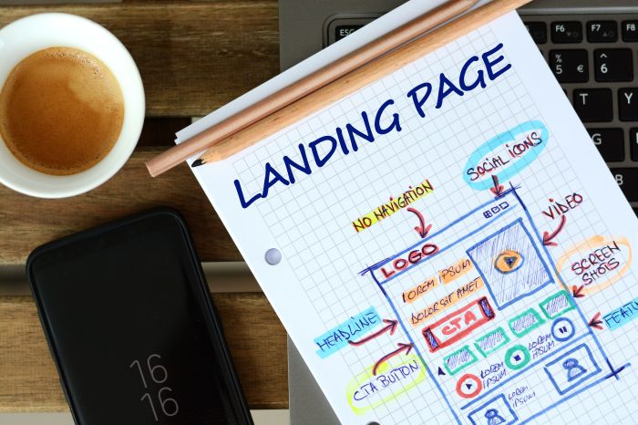
When creating a landing page, there are several key elements that are essential to ensure its effectiveness in converting visitors into leads or customers. From a compelling headline to engaging visuals, each component plays a crucial role in capturing the attention of your target audience and guiding them towards taking the desired action.
Compelling Headline
A compelling headline is the first thing visitors see when they land on your page. It should be clear, concise, and attention-grabbing, conveying the main benefit or value proposition of your offer. A well-crafted headline can pique the interest of visitors and entice them to explore further.
Clear Call-to-Action
A clear call-to-action (CTA) is another crucial element of a landing page. The CTA should be prominently displayed and use action-oriented language that tells visitors what to do next. Whether it’s signing up for a newsletter, downloading a guide, or making a purchase, the CTA should be persuasive and easy to locate on the page.
Engaging Visuals
Visual elements such as images, videos, and infographics can enhance the overall appeal of your landing page and help communicate your message more effectively. High-quality visuals can capture the attention of visitors, create a memorable experience, and reinforce the key benefits of your offer.
Responsive Design
In today’s mobile-first world, having a responsive design is crucial for a landing page. A responsive design ensures that your page looks and functions well on all devices, including smartphones, tablets, and desktops. By providing a seamless user experience across different screen sizes, you can improve engagement and conversions on your landing page.
Social Proof and Testimonials
Social proof and testimonials can help build credibility and trust with your audience. Including testimonials from satisfied customers or showcasing social proof such as client logos, awards, or endorsements can reassure visitors that your offer is legitimate and valuable. Positive reviews and endorsements can influence the decision-making process and encourage visitors to take action.
Design Tips for Building a Landing Page
When it comes to designing a landing page that truly pops, there are some key tips and tricks to keep in mind. From color schemes to multimedia elements, here’s how you can take your landing page to the next level.
Choosing Color Schemes and Fonts
When selecting color schemes for your landing page, it’s important to choose colors that not only reflect your brand but also evoke the right emotions in your visitors. Stick to a cohesive color palette that complements each other and enhances readability. As for fonts, opt for clean and easy-to-read typefaces that are consistent across the page. Remember, simplicity is key when it comes to color and font choices.
Importance of White Space and Readability
White space, also known as negative space, is crucial in design as it helps to create a sense of balance and prevents the page from feeling cluttered. Make sure to incorporate ample white space around your content, buttons, and images to enhance readability and draw focus to the most important elements on the page. Additionally, choose font sizes and line spacing that are easy on the eyes to ensure visitors can quickly scan and digest your content.
Use of Multimedia Elements, Building a Landing Page
Incorporating multimedia elements such as videos and animations can significantly enhance the user experience on your landing page. Videos can help explain complex concepts in a more engaging way, while animations can add a touch of interactivity and visual appeal. Just remember to keep these elements relevant to your message and avoid overwhelming the page with too much multimedia. When used strategically, multimedia elements can capture attention and drive conversions like a boss.
Call-to-Action Optimization

Creating a compelling call-to-action (CTA) is crucial for driving action on your landing page. Your CTA should be clear, concise, and persuasive, prompting visitors to take the desired action.
Placement and Visibility of Call-to-Action Buttons
When it comes to the placement of your CTA buttons, it’s essential to make them highly visible and easily accessible to visitors. Consider placing your CTA above the fold, where it’s immediately visible without needing to scroll. Use contrasting colors to make the CTA button stand out and ensure that it’s strategically placed within the layout of your landing page.
- Position your CTA at the end of your main content to capture visitors who have scrolled through your page.
- Make sure your CTA is mobile-responsive for users accessing your landing page on different devices.
- Test different placements to see which one generates the most conversions.
Strategies for A/B Testing CTAs
A/B testing is a powerful method to optimize your CTAs and improve your conversion rates. By testing different variations of your CTA buttons, copy, colors, and placement, you can determine which elements resonate best with your audience.
- Test different wording on your CTA buttons to see which one drives more clicks.
- Experiment with different colors and shapes for your CTA buttons to grab visitors’ attention.
- Try out different placements and sizes for your CTAs to find the optimal configuration for conversions.
