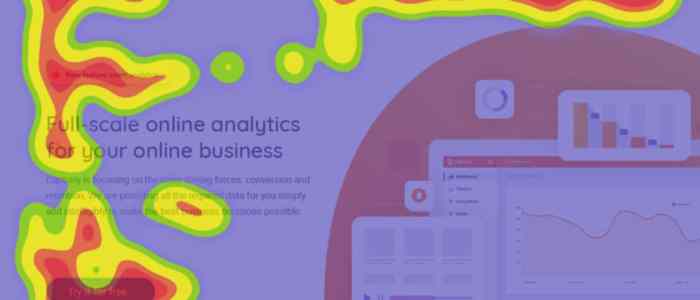
Using Heatmaps for UX sets the stage for a deep dive into the world of visual data analysis, where colors and patterns reveal insights that shape user experience in profound ways.
From understanding click behavior to uncovering scroll patterns, heatmaps offer a unique lens into user interactions, making them a vital tool for UX designers seeking to optimize digital experiences.
Introduction to Heatmaps

Heatmaps are visual representations of data that show the intensity of user interactions on a website or app. In the context of User Experience (UX) design, heatmaps are valuable tools for understanding how users engage with a digital interface.
Types of Heatmaps
- Click Heatmaps: Display areas where users click the most, helping to identify popular or ignored elements on a page.
- Scroll Heatmaps: Show how far users scroll down a page, indicating where content might be too lengthy or engaging.
- Move Heatmaps: Track mouse movement to reveal user attention and behavior patterns.
- Attention Heatmaps: Highlight areas where users linger the most, providing insights into what captures their interest.
Benefits of Using Heatmaps
- Identify User Behavior: Heatmaps offer a visual representation of how users interact with a website, helping designers understand what elements are working well and which need improvement.
- Optimize User Experience: By analyzing heatmaps, designers can make informed decisions to enhance the overall user experience and increase engagement.
- Improve Conversion Rates: Heatmaps can pinpoint areas of a website that may be hindering conversions, allowing for targeted optimizations to drive better results.
- Enhance Usability Testing: Heatmaps provide valuable data to complement traditional usability testing methods, offering a deeper understanding of user behavior.
Types of Heatmaps: Using Heatmaps For UX
Heatmaps come in various types, each providing valuable insights into user behavior on a website. Let’s delve into the differences and significance of click heatmaps, move heatmaps, scroll heatmaps, and attention heatmaps.
Click Heatmaps vs. Move Heatmaps, Using Heatmaps for UX
Click heatmaps track where users click on a webpage, showing the hotspots of user interaction. On the other hand, move heatmaps display where users move their mouse cursor, indicating areas of interest or confusion. Click heatmaps are useful for understanding user engagement with specific elements, while move heatmaps help identify user attention and navigation patterns.
Scroll Heatmaps
Scroll heatmaps track how far users scroll down a webpage, highlighting where users lose interest or stop engaging. This data is crucial for optimizing content placement and ensuring key information is visible without excessive scrolling. Scroll heatmaps provide valuable insights into user engagement and content effectiveness.
Attention Heatmaps
Attention heatmaps analyze where users focus their attention on a webpage, based on factors like cursor movement and dwell time. By understanding where users look the most, designers can optimize the layout and placement of important elements to enhance user experience. Attention heatmaps are essential for creating visually engaging and user-friendly websites.
Heatmap Tools and Software
When it comes to generating heatmaps for UX research, there are several popular tools and software options available in the market. Each tool comes with its own set of features and capabilities, making it essential to choose the right one based on specific research needs.
Popular Heatmap Tools
- Hotjar: Hotjar is a widely used heatmap tool that offers features like heatmaps, visitor recordings, and feedback polls. It provides insights into user behavior on websites and helps identify areas for improvement.
- Crazy Egg: Crazy Egg is another popular heatmap tool known for its user-friendly interface and detailed heatmaps. It offers features like scroll maps, click maps, and overlay reports to analyze user interactions.
- Mouseflow: Mouseflow is a comprehensive tool that not only provides heatmaps but also session replays, funnels, and form analytics. It helps in understanding user journeys and optimizing website performance.
Choosing the Right Tool
- Consider the specific goals of your UX research: Different heatmap tools offer varying levels of detail and insights. Choose a tool that aligns with your research objectives.
- Evaluate ease of use: Look for a tool that is easy to navigate and understand. A user-friendly interface can save time and make analysis more efficient.
- Check pricing and scalability: Compare the pricing plans of different tools and consider the scalability options. Ensure that the tool can accommodate your research needs as they grow.
- Read reviews and testimonials: Before making a decision, take the time to read reviews from other users and testimonials about the tool’s performance and reliability.
Interpreting Heatmap Data

When it comes to interpreting heatmap data, understanding the color gradients is key. The colors on a heatmap represent the intensity or frequency of user interactions on a specific area of a website or app. Typically, warmer colors like red indicate high activity, while cooler colors like blue indicate low activity.
Color Gradients in Heatmaps
Interpreting color gradients in a heatmap involves recognizing the significance of different colors. For example, red areas may indicate popular sections of a website where users are clicking frequently, while blue areas may suggest areas that are being overlooked. By analyzing these color gradients, designers can identify patterns and make informed decisions to improve user experience.
Actionable Insights from Heatmap Data
Some actionable insights that can be derived from heatmap data analysis include identifying the most clicked elements on a webpage, determining the effectiveness of call-to-action buttons, optimizing the placement of important information, and understanding user behavior patterns. By translating heatmap data into actionable insights, designers can make informed design decisions to enhance user experience.
Best Practices for Design Improvements
When translating heatmap data into actionable design improvements, it’s important to prioritize areas that are receiving the most user engagement. By focusing on high-activity areas, designers can make targeted changes to improve user interaction and satisfaction. Additionally, it’s essential to test design changes based on heatmap data to ensure the effectiveness of the improvements.